In tandem with a service channel audit, the UBC Admissions contact page and contact form needed to be updated to reflect some of the findings from internal stakeholder decisions. With this information in mind, I worked with a digital agency to conduct user research and update the design of the page. In addition to this work, I conducted a competitive audit and card sort to further inform findings.
The goal of this project was to improve the user experience through improving the contact us page hierarchy, streamline the contact form, and improve the flow for each step. Secondary goals of this project were to reduce questions and increase number of account holders.
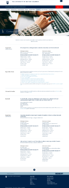
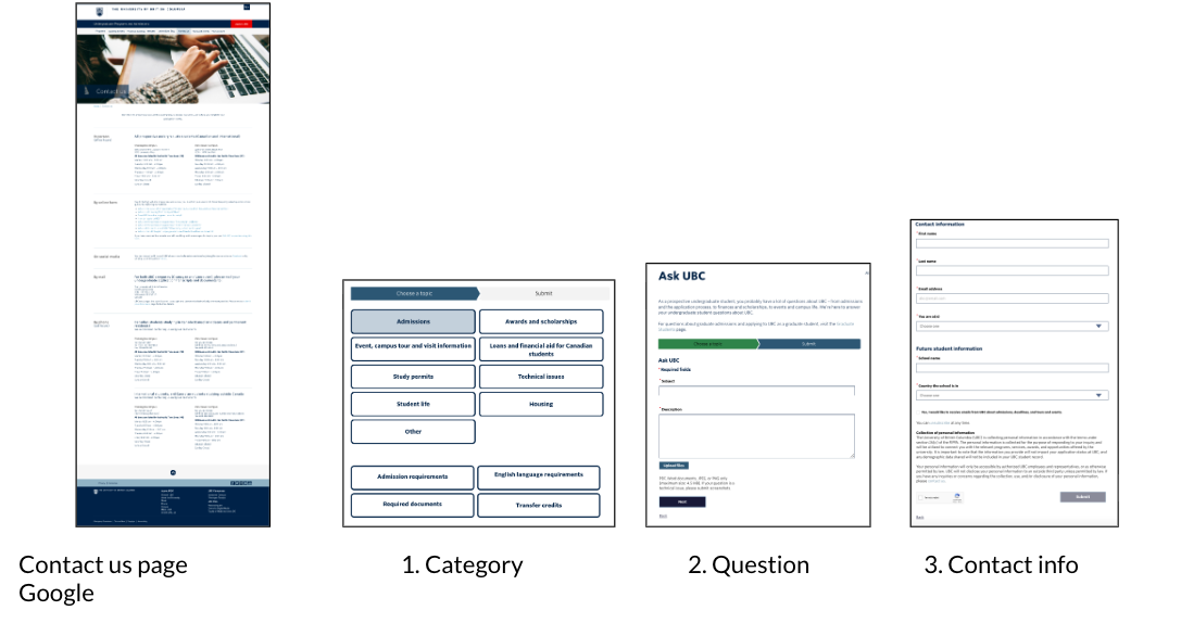
Here’s the contact page before the project began:
Here’s the contact form before the project began:
User Research
I oversaw the agency who ran the user research on the contact us page. Here are the findings:
- Email was the main communication preference
- Call to action to the form was unclear
- Confusion around when to expect a response
When we conducted user research for the form, we learned:
- Unconventional form design confused users
- Multiple pages were long and sometimes confusing
- Profile information was tedious to fill out
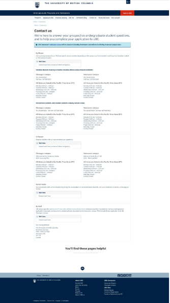
Updated Contact us page
Here’s a summary of the key changes:
- New design
- Clear call to action
- Reorganized channel order based on user priority
- Option to display wait times
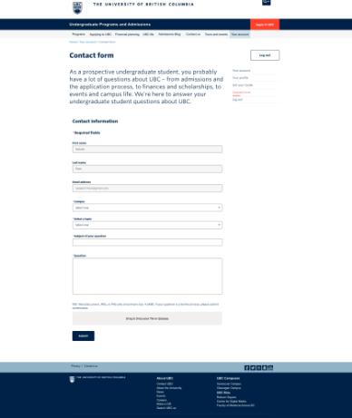
Updated Contact form
Here’s a summary of the key changes:
- Standard form design
- One page
- Reduced number of fields for user to fill out
- New user centric categories (tested through a card sort)
- No captcha/
- privacy statement
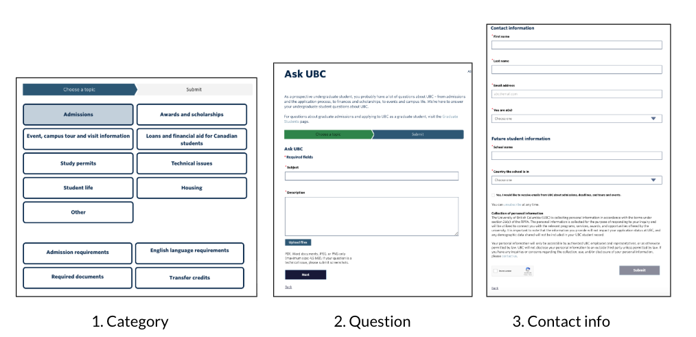
Updated flow
The number of steps in the flow from the contact us page to the contact form has now been reduced. Before the user would access the contact us page, category page, question page, and fill out the contact form. Now, users are able to go to the contact page, visit the login page, and have the contact form in one page.
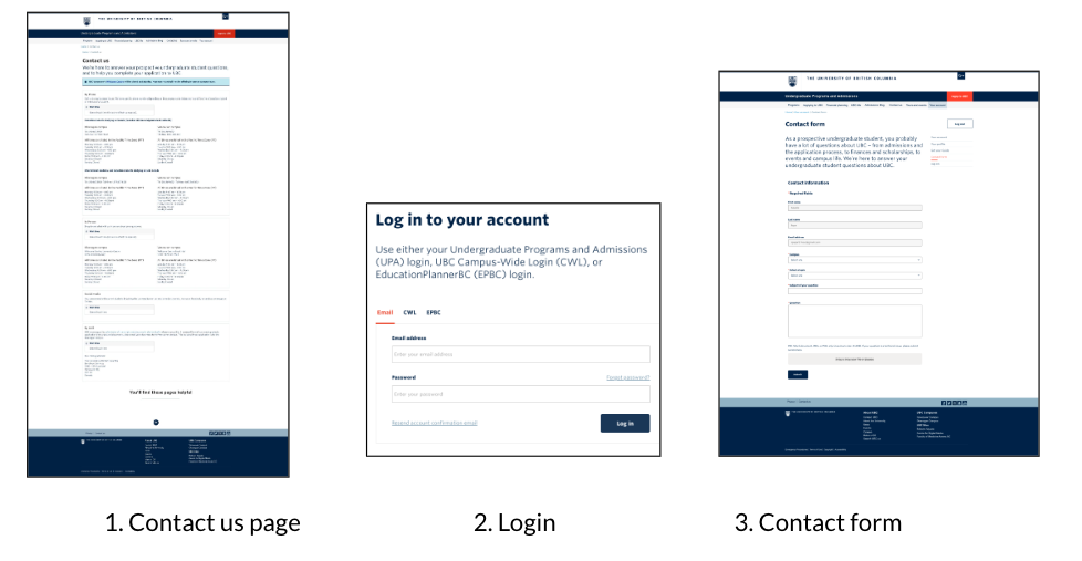
There is now a login requirement to access the form. Through the findings of the service channel audit, led by another team member, stakeholders expressed frustration that many ‘simple’ questions that came in to front lines can be answered by existing web content. Through a competitive audit, it is clear that a login is becoming more common place when filling out a form.
Through careful consideration, we added a login requirement to the flow. Once a user has an account, this saves time for the user when filling out the contact form as the form is pre-filled for them. The addition of the login also helps prompt the user to pause before they ask their question, benefiting the frontline teams. This flow was later user tested, and we confirmed that all users were able to navigate the addition of the login successfully.
Results
Here are the results of the work:
Contact us page:
- Time on page was reduced: before the project time spent on the page was 1 minute and 7 seconds. After the project, time on page was reduced to 54 seconds.
- Finding the form: before the project users struggled to find the button, after the project users still struggled to find the button but we have since updated the language on the button to address this.
Login:
- Reduction of questions: anecdotally we have seen a reduction in questions through the form and through case count. Before the project, there were 20770 cases submitted in a 6 month period, and after the project there was a total of 16242 cases submitted in a 6 month period the year after. There was a 21.8% decrease in questions.
- Increase in accounts created: before this project there was 29,968 accounts created in a year. The next year there were 33,134 accounts created.
Overall, the goals that we set out to accomplish were achieved.
