Stakeholders shared that this page was not meeting their needs for the following reasons:
- Previous year, there were about 100 applicants who didn’t meet the financial needs eligibility requirement
- They want to reduce unnecessary clicks to the application if needed (operational cost for the application and users)
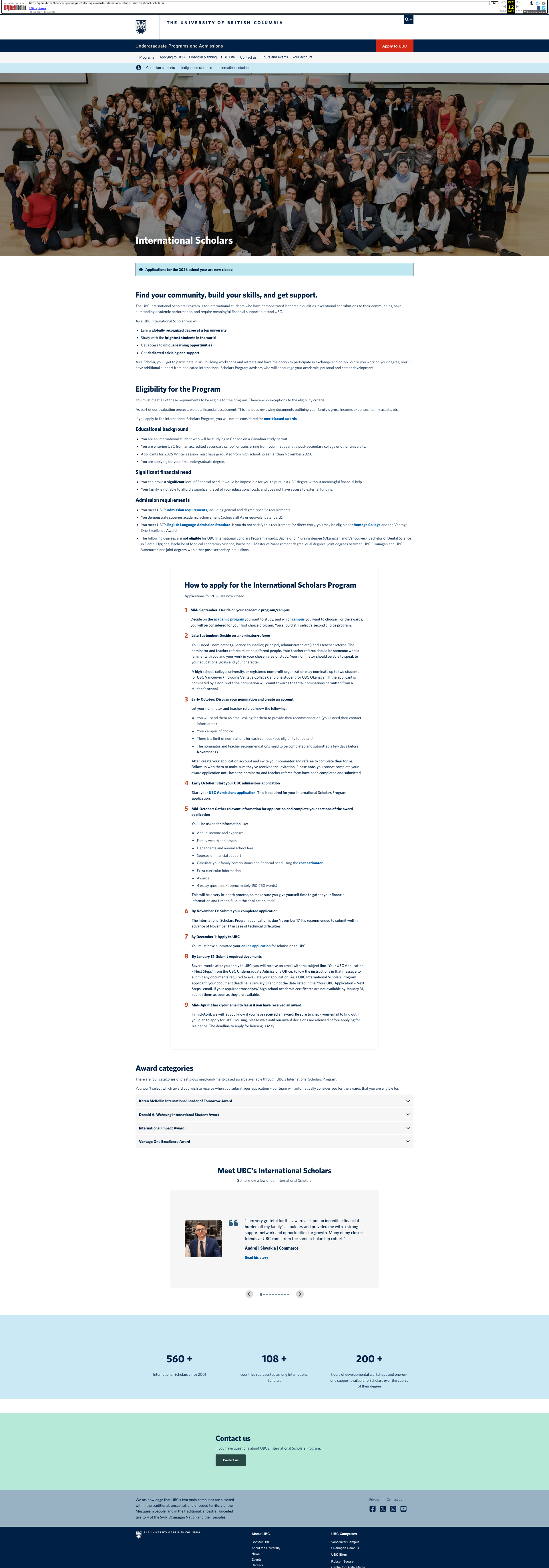
Before the project, this is what the page looked like:
Findings
I was able to learn about how the page got to the current state and dive into the application itself to get the full picture of the existing state of the content at the time.
The page itself was really well done, however the prioritization of content didn’t emphasize the tasks oriented items. There was also an overwhelming amount of emphasis on the page for marketing content, but it drowned out the task content. Even visual elements like icons/stats/testimonials cut off the page in a way that lowered the appearance of importance of the core task content. The page itself was written at a Grade 13 reading level.
Stakeholders shared that they would like to reduce unnecessary clicks on the application itself. Every click on the application increases the cost to the business. In the application itself, I found 2 PDFs that users were instructed to click. One PDF was a PDF of the entire application. One PDF was just a list of instructions about the application itself.
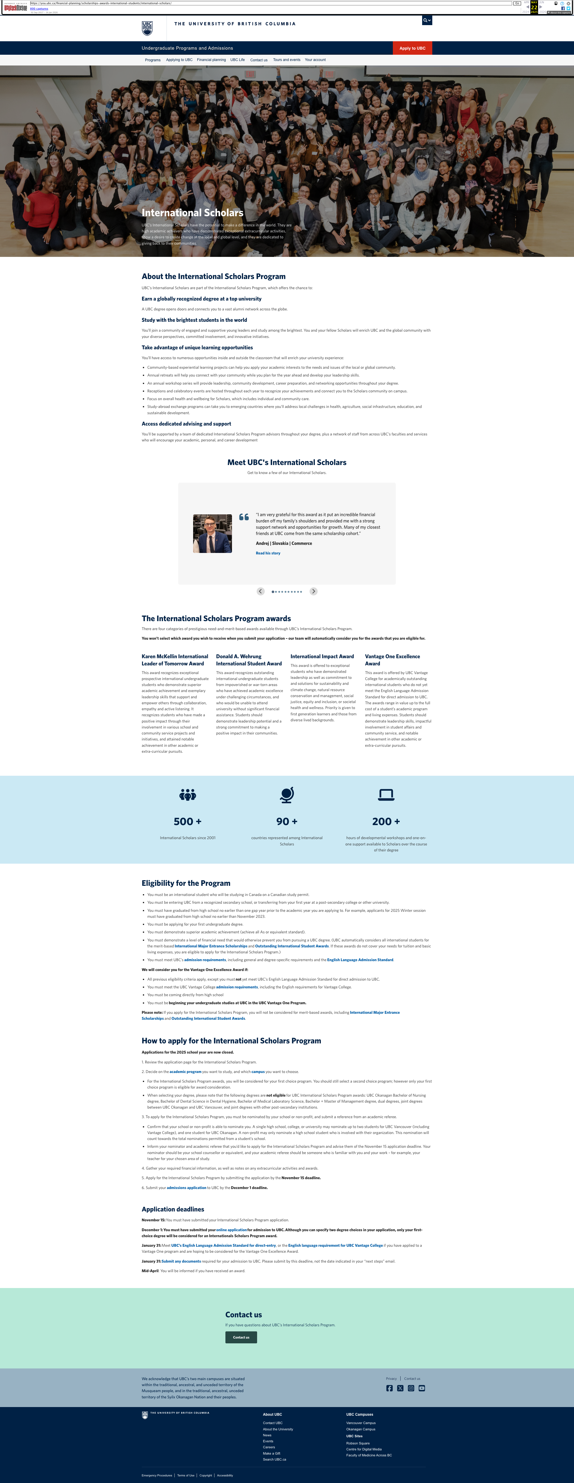
Results
I led several workshops with the stakeholders to do peer writing and re-priortized content and the page is now at a Grade 11 readability level. The page itself has an improved flow. Here’s how that happened:
- Marketing language is succinctly placed at the top of the page to ensure we’re still differentiating ourselves from competitors.
- Eligibility section has been updated for clarity and placed higher on the page for emphasis
- How to apply has been updated for clarity, placed higher on the page for emphasis, and a ‘steps’ component was used to add visual treatment. Additionally, more details of the application were explained to reduce the desire for users to click on the application itself (saving business $).
- Award categories is background information that users may use to inform how they write their application, this was placed lower and details were tucked away in accordions
- Testimonials and stats were moved to the bottom of the page
When looking at the application and the page itself, I was able to recommend changes to the application, that impacted the page itself:
- Removed 1 PDF that was a PDF of the application in the application. As mentioned earlier, we outlined the high level topics of the application on the webpage so users understand what to expect in the application. Having a PDF of the application was no longer necessary.
- Removed 1 PDF of instructions of how to use the application. We pulled content from the PDF and built it into the page. I also provided detailed recommendations for where to put the remaining content (and re-wrote it) into the application itself. This included intro text, instruction text, etc.
See below for image of the page after the work was conducted.